Showing posts with label t-shirt design. Show all posts

Friday, December 5, 2008

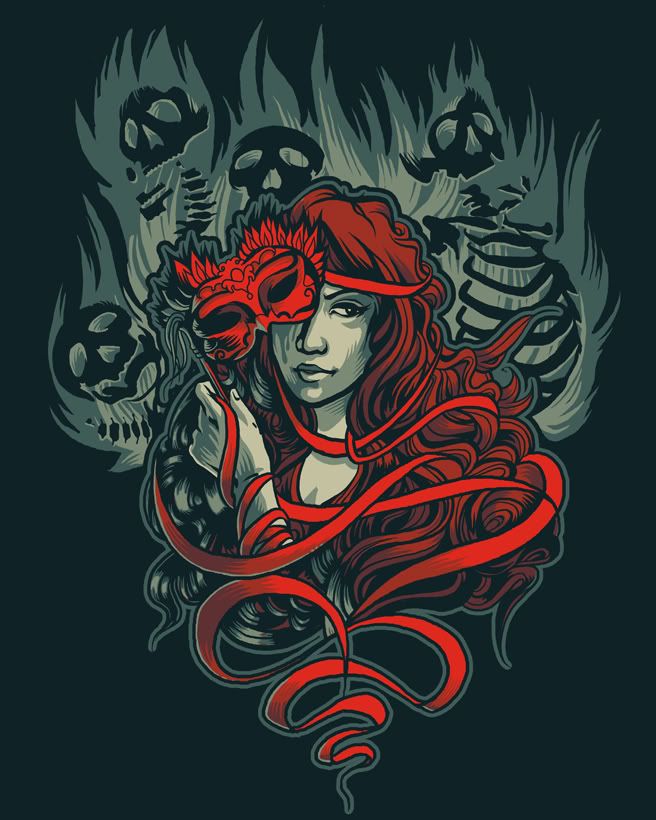
Shirt.woot entry: Masque of the Red Death

EDIT: Larger image. :)


Derby entry for this week's theme. Click for details.


I like it. I probably won't in a few days, but for now...I like it. Seems awfully familiar, though. :p

Also, vote for my significant other - he decided to make some entries since he had a bit of free time. Divine Comedy and Harry Potter!

Friday, November 21, 2008

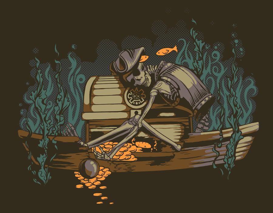
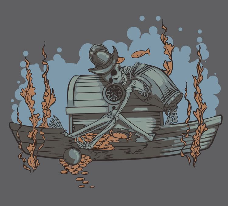
Shirt.woot entry - Greedy Pirate

Edit: Hello, deviantart! This is my blog. I've got tutorials, and I update with a lot of works in progress - feel free to explore. :)

If you like him as a t-shirt design, there's a 60 day hold on designs - but I do have a shirt available on shirt.woot at the moment if you'd like to see.

I was feeling sick last night and didn't get to work on an entry, so I woke up this morning and decided to play with Greedy Conquistador.


I added a lot of new shading and messed with the colors. It seems less dull, at least.

P.S. HAPPY 10th BIRTHDAY OCARINA OF TIME

Sunday, November 16, 2008

Friday, November 7, 2008

Shirt.woot double-take derby

Detail pictures and voting links for designs in the double take derby:


Also, guess the third mystery entry (not eligible if the moderator above woot's privacy policy told you already). ;)

Tuesday, October 14, 2008

Tools for Creating Halftones (Part 2)

My last post gave the basic instructions on how to create halftones - now it's time for a post about the tools used to create the different shapes, sizes, and effects halftones offer.

Tools for Halftones


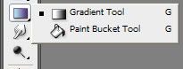
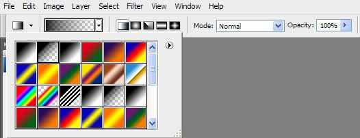
1. The Gradient Tool.


This is where a lot of halftones begin. Make sure the options are set up so that any gradient you make fades transparently, if you're working on a t-shirt design and need each layer to have a separate color.


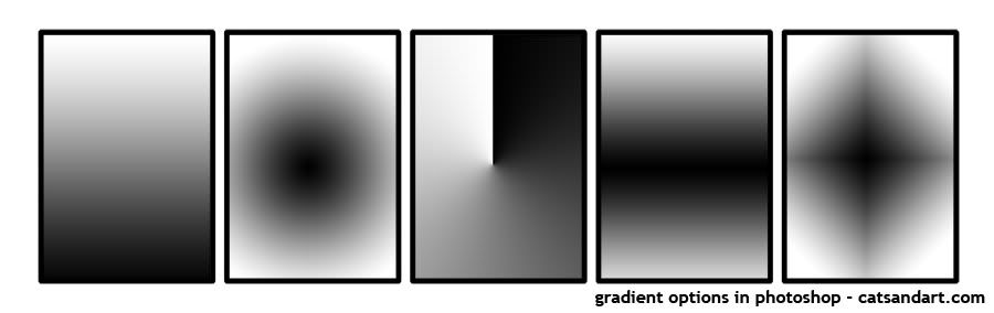
Photoshop has five different gradient shapes:


2. Photoshop Brushes

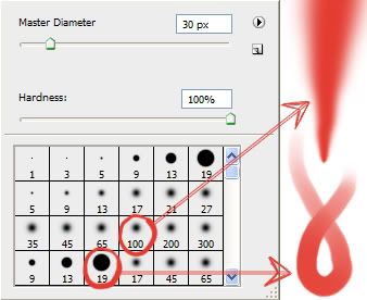
There are two standard brushes I use to create halftones, with a little editing in the brush options. The first one can be used with a mouse, and the second one is more tablet-centric:


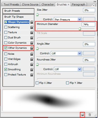
The first brush, size 100, is useful for shading in larger areas that don't necessarily work with a standard gradient. If you're using a tablet though, it might get too pointy at times. What I did was change the minimum diameter of the brush. Other times it might be too dark - but you can change that as well by selecting other dynamics in the brush editor.

To open up the brush editor, go to Window > Brushes.


The second brush already changes opacity with pressure. If I need to shade with a little more detail, I lower the minimum diameter on that brush.

To save any changes you make to a brush, click the icon in the lower right hand side of the brush editor (highlighted in the screenshot above).


3. Selection Tools

This includes the Lasso Tool, Magic Wand, and everything underneath the "Select" portion of the menu. It is useful when creating custom halftones, because it can:

a) Limit the area you color in, especially when using big, fuzzy brushes - less clean-up time later.
b) Save previous selections you've made, so you don't have to redo them again and again.
c) Modify the selected area automatically.

The ones I use a lot in particular are:

Magic Wand - Sometimes I draw out a shape with a brush - such as a cloud, for instance - and instead of tracing over it with the lasso tool to color inside, I select it using the magic wand. Of course, this still leaves some of the background visible in between the color and the line, so I use the next tool in the list to fix that.

Select > Modify > Contract, Expand, and Feather. - Each of these has their uses when using an automatic way of making a selection.

- When I want to color inside of a whole design with a lot of details, I select the area around it. Then I go to Select > Inverse, which inverts the selection so that I can draw inside of the design. But, there is still a visible area outside of the line because of the way things are selected. So I go to Select > Modify > Contract, and choose the number of pixels based on how thick the lines are.

- On the flip side, when selecting a space from the inside, I use Select > Modify > Expand.

- Feather can help you create a gradient customized for a certian shape.

Select > Save Selection, Load Selection - Allows you to save selections you've made, which is really useful if you spent a lot of time selecting or tracing various parts of a design. If you end up having to re-do a section, just go to Select > Load Selection to bring it up.

-----

Confused? Part 3 is going to be a walkthrough on creating an actual design with halftones - all pictures and text in a jpeg so you can open it in Photoshop and read as you go along.

Monday, October 13, 2008

How to Make Halftones (Part 1)


Basic Procedure

E-mail me at hannahmariebear@gmail.com if you need help or if an instruction is unclear. I am working on a picture version.

1. Create a new file, with 300 pixels/inch resolution. On a new layer, make a colored gradient using the gradient tool.

2. Go to Image > Mode > Grayscale. Choose “Flatten.”

The three options it shows are Flatten, Cancel, and Don’t Flatten. ‘Flatten’ merges all layers and converts to greyscale, ‘Cancel’ does nothing, and ‘Don’t Flatten’ leaves the layers intact and proceeds to convert the file to grayscale. All layers must be flattened to create the halftone.

3. Press Ctrl+L to bring up the Levels options (this can also be found by going to Image > Adjustments > Levels).

A colored gradient will not have any solid areas after it is turned into a halftone, because it will be a shade of gray, initially. Halftones are created based on the lightness of the gray.

4. In the Levels box, slide the black arrow so it is just underneath where the graph starts.

Depending on which color you chose, this graph will look a lot different – but it always has a starting point. This makes the image dark enough to have solid color in the halftone just like the gradient.

5. Go to Image > Mode > Bitmap. Make sure the resolution is 300, and select “Halftone Screen” from the dropdown menu. Click “Ok.”

The resolution should be the same as the document you’re working on – otherwise you might end up with a halftone too small or too big for what you’re doing.

6. Experiment! Play with the numbers in the next box you see and just press Ctrl-Z to undo the change, and do step five again.

Frequency determines how large the dots are – lower numbers make the dots bigger, and higher numbers make the dots smaller. Angle determines which way the halftone points (enter a value between -180 to 180). I usually have mine set to 45 degrees. Shape refers to the actual shape of the halftone dots/lines.


Using the Halftone in Another Image

1. Go to Image > Mode > Grayscale. Leave the Size Ratio at 1.

Converting the image back to Greyscale mode gives you access to options that aren’t accessible in Bitmap mode. Size Ratio scales the image down with numbers larger than 1; 2 makes it smaller by 50 percent, etc.


2. Go to Select > Color Range. With the eyedropper tool, click on a black area in the halftone.

The preview image in color range should look like your halftone with inverted colors. Fuzziness refers to the range of colors that will get selected – a smaller number means less, a larger number means more. Bitmap converted everything to just black and white, so 1 will do here.


3. For colored halftones: Image > Mode > RGB Color. Create a new layer, fill with the paint bucket tool, then copy and paste into the destination file.

I find that this is easier to do than copying the black halftone into the working file and changing the color there.


Glossary

Angle - determines which way the halftone points (enter a value between -180 to 180).
Bitmap – turns images into purely black or white, with no grey or color.
Color range – makes a selection in Photoshop based on colors.
Don't flatten - leaves the layers intact and proceeds to convert the file to grayscale.
Flatten - merges all layers and converts to grayscale.
Frequency - determines how large the halftone dots are – lower numbers make the dots bigger, and higher numbers make the dots smaller.
Fuzziness - refers to the range of colors that will get selected in Color Range mode – a smaller number means less, a larger number means more.
Gradient tool – tool in Photoshop, usually bundled with the paint bucket tool, that creates a gradient in various shapes.
Grayscale – mode that converts color images into grey.
Levels – (shortcut: Ctrl-L) adjusts shadows, mid-tones, and highlights.
Paint bucket tool – fills a selected area with color.
Resolution – amount of detail in a bitmap image
Shape - the actual shape of the halftone dots/lines.
Size Ratio - scales a bitmap image down with numbers larger than 1; 2 makes it smaller by 50 percent, etc.

Friday, October 10, 2008

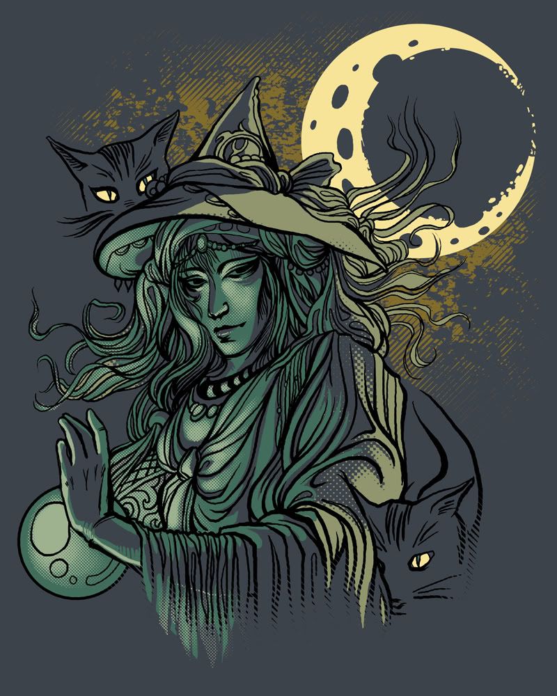
Shirt.woot entry - The Witches Pets


Took the opportunity with Shirt.woot's latest derby to:
a) Show off my kitty cats.
b) Try to draw Amano-style again.
c) Draw some kitty cats.
d) Try to get voters that want a Halloween shirt that they don't have to overnight (thanks, woot!).

Tuesday, October 7, 2008

Intro to T-shirt Design

A basic walkthrough for readers that don’t come from t-shirt sites. :)

Programs

Programs like Photoshop and Illustrator or their free alternatives like Gimp and Inkscape work fine for t-shirts. If it can use layers and work with 300dpi, you’re good. For interesting effects, you can try using Corel Painter. Flash is useful for line-work if you don't have a tablet but want to have the effect of pen pressure.

Getting ready to design

Setting up the file
Different t-shirt sites handle different sizes - Shirt.Woot is up to 16"x20", Threadless is 15"x20”, Design by Humans goes up to 20"x24" - so it's important to check what size your file needs to be, and work at 300dpi.

Keep colors separate
Keep each individual color on separate layers. When t-shirts are screen-printed, each color is assigned to a different screen - so everything has to stay apart in the end. There are some sites that require you to keep colors separate, like shirt.woot, so it's a good habit to get into.

Limiting colors
Sometimes, sites limit the total number of individual colors that you can use. Design by Humans and Threadless have a limit of 8, Shirt.woot is 6, and so on. The background color - or, the color representing the t-shirt - doesn't count towards the total.

What to do with a finished design

When you have your design in hand, there are a number of things you can do with it. You can submit it to a daily/weekly t-shirt site, like the following:

Designbyhumans.com Shirt.woot.com Teefury.com Uneetee.com Threadless.com

Each has their own audience with particular preferences, so before you decide to submit, look around to see which place your design fits in best with.

---

If you decide to go the self-publishing way, you can use an ‘on-demand’ type service, like the following:

Spreadshirt.com cafepress.com bountee.com redbubble.com printfection.com zazzle.com

There are tradeoffs with each route. On-demand services usually use digital printing, which can be limited compared to screen-printing (quality, techniques available, etc). With the exception of teefury, going the daily/weekly t-shirt site route often means losing control of your design.

You can also get a design screenprinted from a shop, and sell it via your own website, or using a service like etsy.

Getting the design ready to submit

Each site has a different template that they want you to use so it can be displayed on their site. Here's an example from a few different sites:

Shirt.woot derby - 580x580 image, showing the shirt placement and a detail image; 240x240 preview image. Everything is converted to a jpg.
Threadless - 640x800 image, showing the shirt placement and a detail image; 100x70 GIF preview image. You have the option to use flash with the larger image.
Design by Humans - 900 x 500 image, original artwork only and a 500x400 image, showing placement on a t-shirt.

What happens to the design after submission

Usually, when you submit a design to a t-shirt contest - or a t-shirt site that ISN'T self-publishing like cafepress - a 'hold' will be placed on your design. This is so a designer won't take a design to many sites at once. If your shirt isn't printed, this hold lasts anywhere from 60 to 90 days.

If the shirt is printed, the site generally holds the rights to printing it permanently - so once it's printed, you can't take it to other sites as you've been paid for it. ALWAYS read the terms and conditions. If you don't like the compensation you'd receive, you can always take it elsewhere.

Saturday, October 4, 2008

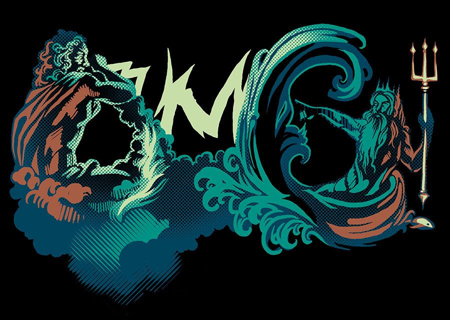
Shirt.woot entry - OMG!

A few of my friends started talking about an idea for shirt.woot's current themed contest, which is "art as text," and wanted me to try it. I thought it was funny - gods spelling out OMG! - so here you go. :)

Voting link!

Detail image:


I doubt this is a "permanent" move back to entering at shirt.woot, but as I said before - if I find something interesting to do, I'll do it. :)

Thursday, October 2, 2008

Thoughts on t-shirt design, a tutorial (part one)

I started to write up a few thoughts on t-shirt design, and figured I'd post one to motivate myself to finish the next part. Just reviewing random problems I see on finished designs in places like shirt.woot, in a tutorial type fashion.


Sometimes I see someone with a good sense of design, but ambition got ahead of their skills at the time. Biggest example is drawing the human figure without knowing how or finding ways around it - this one happens everywhere. It's disappointing to see a nice image shout amateur because one element gave the artist trouble, when there are a ton of resources out there to help.

In other words, stop and reassess what will be in the final design if a part of it is creating a lot of trouble.

"Use what works. Ditch what doesn't." - ansharp

Reminder - this applies to designs meant to be sold, and need a polished, professional look. Pushing yourself in practice is good!

Ways to avoid this problem:

a) Find references to learn from. Don't know how to draw a cat's leg? Look up images of cats to study, or even a skeletal/muscular illustration for an in-depth approach.

What to watch out for: Referencing doesn't mean directly copying or tracing - carefully avoid it when looking at another person's photograph or illustration. Eyeballing can still result in a copy!

b) Find stock images. Sometimes people offer their photographs - of themselves and things around them - and allow commercial usage with no fee. There are also pay sites to consider.

What to watch out for: ALWAYS read usage guidelines carefully. While some stock sites allow commercial use, not all of them do and others have special requirements.

c) Take photographs for reference and build up a collection. A large, varied collection is a valuable tool - not to mention no conditions to worry about.

d) Ask a friend to pose, or use a mirror to pose something you have in mind.

---

Hopefully, I will have part two up next Thursday. :)

Sunday, July 20, 2008

Phoenix


Work in progress. Undecided about the shirt color. Mostly just needs to be taken into Illustrator to clean up everything; a lot of it was drawn in Photoshop zoomed out, so the lines get a bit shaky.

Saturday, July 5, 2008

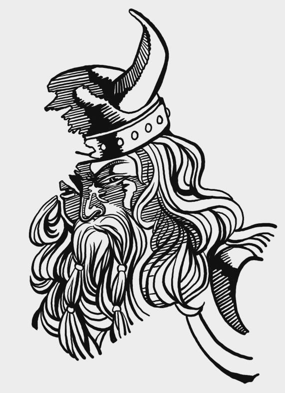
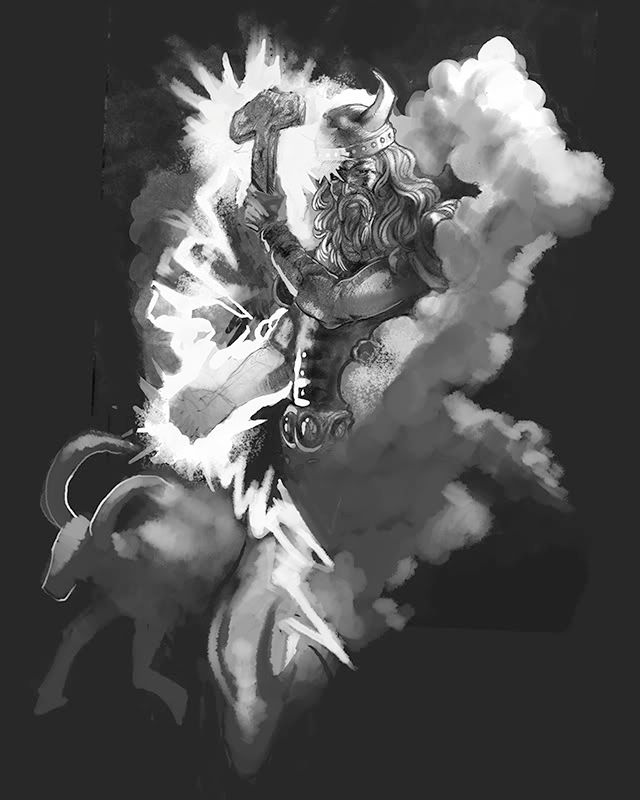
Epic Thor - work in progress


Say hi to Thor. I had too much fun sketching him. :)

Friday, April 4, 2008

Greedy Conquistador


An entry to this week's derby at shirt.woot, the greedy conquistador. The theme this week is "Greed."

It was originally a pirate, but pirates were banned after I sketched it. So he is now a conquistador, having tried to steal his ship's ill-gotten gains.